Halm, who according to his social media profiles just graduated from Harvard, tweeted that he’s simply in the arena trying stuff.
“I just wanna buuuuuuuuilllddddd” goes the annoying little fuck even before he’s asked any questions about social impact and such
“The goal is to create the most addicting & personalized image recommendation system. V1 is as simple as possible. Future versions trained on current data will enable even more personalized images & user interaction in image generation."
just fuck right off
couple things:
- in the article it turns out he isn’t even actually generating the images, he just created 187 AI images and it rotates through them
- one of the most insane things about our society right now has to be that someone can come out and say “the goal is to create the most addicting thing” and expect praise for it :/
- a woman made a version with men, “FriendOrFoeAI”, and the twitter replies (and her replies to them) are amazing
one of the most insane things about our society right now has to be that someone can come out and say “the goal is to create the most addicting thing” and expect praise for it :/
We have been primed for this

Y’know, I don’t recognise either of these things (prima facie). Might recognise output influenced by / derived off them?
But now I guess I have to look at ‘em both sometime
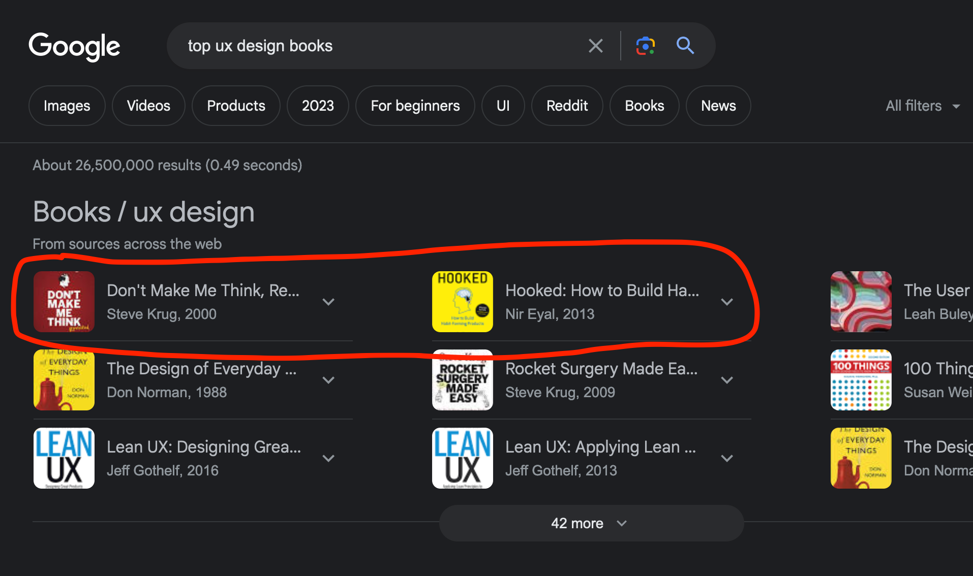
Don’t Make Me Think is arguably the seminal web design book. Its first edition was a series of UI design principles accompanied by an example of how Amazon does it. I know there have been revisions, and I’m assuming most of them are new examples to replace the Amazon ones. It was from a time when Amazon could fit their product categories on one row of tabs. Anyway, all of the design principles are based on removal of navigational barriers. It’s a very good book and one I used a lot in my early days. My loss of love for it is based on the sense that it played a significant role in the rise of UX and standardisation of these techniques separate to the things they are applied to.
Hooked, on the other hand, is a step-by-step guide to making casino games disguised as useful apps. It’s a shameful book and its popularity in the community is representative of the confused motives of UX practitioners.
Both worth reading if only to come back and argue with me about my views :)
“fine tune mating preferences” eurgh, who let the evopsychs see this?
Yeah I saw (1). It mostly made me almost chuckle in the “I’m actually wincing inside” way (I’m not even surprised at that kind of grift anyway, I’ve just seen too much of it from coiners)
To (2), heh. Yeah, it’s pretty wild.
(3) I saw, but didn’t see the replies because i refuse to give birdsite logged-in view metrics. My tiny part in helping nosedive Felon Tusk’s shittery. But it in turn means I can’t see replies, because they intentionally broke reply-visibility on loginless display
I more meant my post as to the person instead of the “product”, but I guess I wasn’t really clear about that, mea culpa
Oh I wasn’t commenting to criticize you – just adding more insane context for people who didn’t feel like reading the full article lol
Fair enough :)
Because workthings I’m in super literal mode all day and don’t tend to read tone/subtext by default
No worries!
at least this shitgoblin is honest about the intended datagrab. very, very minor win there.
Imagine graduating from Harvard and doing this. What was the point
deleted by creator
They could have just watched Weird Science


