
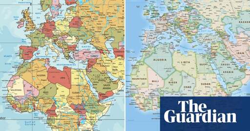
Equal Earth looks quite good imo

I really don’t care. But as far as i know. The landmass distortion on mercator is “corrected” by having boxes of “different sizes” across the map. Except that each box is actually respresenting the same km2
I don’t know what image on the article is about.
When looking into the eckert IV, this seems to be as accurate it gets

Which i think is quite good. It’s a good compromise between shape and landmass, by NOT projecting it on a rectangle.
Now compare this image, to the one in the article.
It looks so stupid how they’re trying to overlay them while removing the context from both.
Let me guess, the US and Israel will vote against it.
Only the US voted no
You could have read it.
You are right, I misread the article. I believe the vote was set to happen, not that it had already taken place.
Doesn’t matter, still a flat earth. Checkmate globetards /s
WTF why do you have to vote ? Just go with the evidence and facts.
This may come as a shock to you. But it’s mathematically impossible to show the full surface of a sphere on a rectangle without distortion.
The mercator projection has these smaller rectangles of “different sizes” across the map. There’s a reason for that. They show the distortion of size, in favour of highlighting shapes and angles of continents
This “new” map will also have distortions. Though they will be far more difficult to show on the eckert IV projection, becase angles and shapes are now distorted, in favour of highlighting relative landmass.
So what evidence or facts is it you’re talking about? Both are projections of a sphere onto a rectangle. There will always be distortion.
Can we also make Greenland so small that people over the age of 80 cannot see it?
Inb4 Trump claims the nation of Africa is rightfully his
Why not just make the official map a globe? We’re in the digital age ffs.
Well, if you’re going for fidelity, the planet is not a perfect sphere. Regardless, a 3D map is harder to parse and render so it makes sense to use 2D.
Eh, a 3D sphere with mapping is quite workable. Bing maps can click over an overly detailed globe and the ‘sphereness’ of it only starts to matter when you zoom out. It’s only a bit of a strain because of the texturing, and it’s not much of a strain at that.
It would not be crazy to have a more accurate interactive behavior instead of assuming that zooming out enough to see continents should still be flattened out.
Okay, you show a globe, or rather, represent a globe on a 2D surface.
Now you cannot have a single map that shows everything. And your 2D representtion is distorted anyway.
A very quick turn let’s you see the other half. Bonus, you can look at it from the perspective of a pole and get a much better view of the parts of earth that map projections just utterly mangle. Particularly helpful for understanding arctic geopolitics.
The distortion only applies if you take the screen flatness literally, and no one is going to accuse a 3d game of being hopelessly distorted by virtue of being on a flat screen.
A very quick turn let’s you see the other half.
Okay, I’ve turned over the paper and the back side is blank.
I think you miss the point that with a globe, you can’t easily compare different parts of the earth. Do you truly not understand the advantage of being able to see all of the earth at once? Come on, dude.
Even if it were workable, what’s the benefit? This might sound a bit exaggerated but if you move from 2d to 3d and taking into account the number of people constantly looking at a map on their phones, car, etc, you’d be consuming way more energy and seeing absolutely no benefits.
Well, the benefit is this very discussion here, that 2D projections necessarily have distortion on zoom out…
Note that the 2D map is almost certainly already rendered into a 3D context, it’s just how modern graphics are done. Rendering textures to a curved modeled surface for isn’t significantly different than rendering them to a perfectly flat modeled surface.
Even better than Bing maps, if you go to Google maps, click ‘layers’, then click ‘more’ and check ‘globe view’, then you have a google maps that on zoom out just happens to render to sphere instead of 2D. Not the least bit more resource intensive, apples to apples with the same textures that it would have used to build the 2D map but just projected onto a sphere instead.
Do you care about directions or geography? 99 times out of 100 I think it’ll be the former.
Directions work fine, at that scale you can’t even see the difference between a globe and a flat map. It’s just zooming it out.
You have to zoom out to see about 500 miles on the screen before the curvature would even be very noticable, and at that point you aren’t caring about the navigation in detail any more.
The one travel related thing is getting a better immediate sense for why a plane or boat runs a particular course which doesn’t make sense on a typical map.
“This discussion is not a political discussion [but] a scientific discussion, because there is scientific proof so we all have to accept the reality,” he said.
Bit of a weird statement, haha. Of course it is political, the scientific reality is you cannot perfectly map a sphere to two dimensions… The political part is what we agree to sacrifice, and - in my opinion completely fairly - they want to take “relative land area” off the list of sacrifices.
I think it’s preemptively calling it out because Conservatives are absolutely going to make a map projection political
The Obverse Peters Projection?
Yay, i get to post my favorite West Wing bit again!
You can’t map a sphere to a plane without distortion, it will always look off because their Gaussian curvatures aren’t the same. The best you can do is approximate it. I remember there is one type of map where they offload the distortions to the ocean so the countries look a bit better.
Map projections are a whole science.

Veto!
The equal earth map is fine ig, but a butterfly map would look sick as the un background.
What would be a significant change if they do this?
I don’t think showing Africa larger will change one thing about how the rest of the world treats African nations.
Either way it seems irrelevant, so whatever floats your boat.
It’s about changing perceptions.
If you can minimize an entire continent, let alone a single country, as some “small place”, you can more easily shuffle them away as “trivial.”
You’re thinking about this too shallowly, as if all thoughts come in big blocks, instead of built up from the various iotas of data you filter through every second of every day.
Why not the 150E meridian
so New Zealand can finally have its revenge?Google Maps
Not sure what they’re gonna do, interactive maps are pretty tied to Mercator unless you want weird distortions.
Interactive maps actually have the opportunity to do the right thing and just show you a globe on lower zoom levels. Wrapping a texture around a sphere is trivial for almost all hardware nowadays. That’s how I have my OsmAnd set up and it doesn’t impact performance at all. It’s a shame that not enough maps do that.
interactive maps are pretty tied to Mercator unless you want weird distortions
Can you explain?
Mercator preserves angles and straight lines. Wherever you zoom or pan on a Mercator map, north is still at the top, east to the right, etc. By contrast, for a projection without those properties (which is basically none except minor variants of Mercator), north is going to shift around depending on where you’re looking.
By way of example, here’s Auckland in the Equal Earth projection the article discusses, with north marked:
spoiler

It’s significantly tilted and actually slightly curved. This is not useful for navigation, or really anything except exactly what Togo wants to achieve (which in general is exactly what you want for the sorts of global maps the UN is likely to make): knowing that any two areas that are the same size on the map are the same size in real life.