
I’ve been using vertical tabs for a while, and I do think that the round icons are 1: better suited to the design of the majority of favicons, and 2: offer a quicker visual separation at a glance. It’s easier to distinguish between tabs.
If you prefer horizontal tabs, the rounded tabs with a light stroke are even more stark. Firefox has long had a problem with the visual language of the tabs. It has been hard to clearly distinguish between active and background tabs. If you were not already familiar with the color scheme, and someone showed you a window with two tabs, you’d have to make a wild guess to know which was the active tab. Chrome for example represents this by connecting the active tab to the window view - immediately clear. The old Firefox tabs were ambiguous because they didn’t connect, and they also weren’t clearly separated. This design makes a clear commitment.
The new app icons are gorgeous. The design looks more coherent across the app. It manages to be modern and clean, while presenting a characteristic personality. For too long, Firefox has been chasing trends and aiming for a middle that doesn’t exist. Firefox is different and should look different. I think it’s much better to make a visual statement that not everyone will love than to have no perspective at all.
Some people have railed against the new default theme. It’s not for everyone, but there are 1000s of official and user-created themes to choose from. I have been using a custom theme for ages precisely because the old default theme was ugly.
A small addition, I use Firefox as my default PDF viewer. The new viewer has a few minor improvements and fixes one or two past missteps. I’m sure folks will (rightly) say there are better options for a PDF viewer, but it meets my needs.
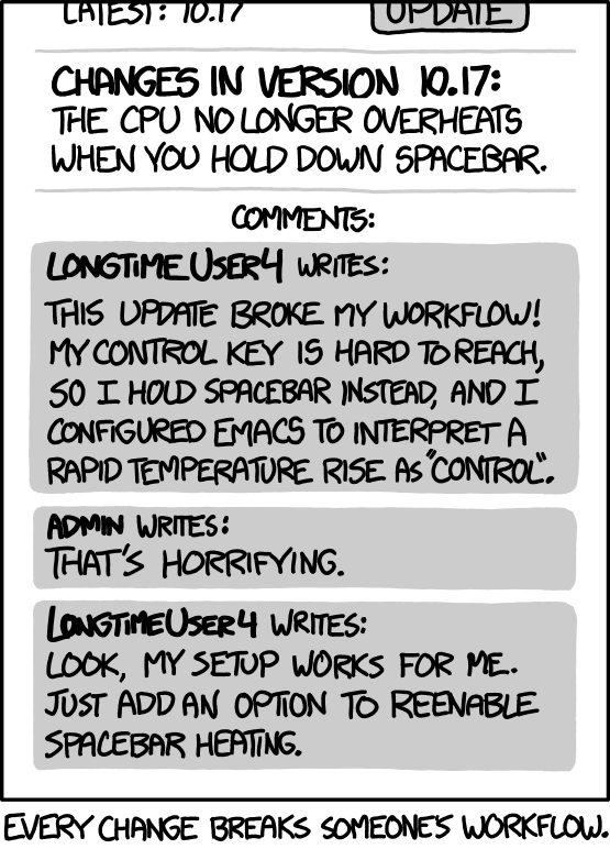
I doubt that’s an unpopular opinion. It’s just easier to complain than to praise and we have a lot of techies here who have their specific workflow + customizations that are disrupted by the changeover.
deleted by creator
Counterpoint: They need to get into the news to attract new users. There is no better way to do that than to update the theme or the icon.
deleted by creator
But it isn’t bad publicity. The reporting on a new theme or icon is generally pretty neutral.
deleted by creator
Mozilla ought to consider that fact when making irreversible visual and workflow changes.
I mean I fully agree with the test of your post, but you can literally set a single flag to get the old ui back. Not exactly ‘irreversible’. To be fair, we don’t know how long that flag is gonna exist, and three probably won’t be any (meaningful) work on the old ui either.
deleted by creator
I like the new design too as a horizontal tabs user.
Personally i like the new rounded tabs. A small change and of no practical benefit but nice none the less.
I find the highlighted tab much easier to find now in default dark mode, I consider that a practical benefit
I just think the firefox UI guys are bad at their job.
I’m warming up to the vertical tabs. Love the rounded design elements and colors.
Honestly I keep a dev version installed and the vertical tabs on that- it’s very nice.
I’m a little less enthused horizontal but it’s not bad. And now I’ve found a theme called proton that is more like the old dark theme that is just black all around so that’s fine too.
In any case, most people either will like it or not care. Lemmy is a pretty negative place overall so I don’t take it to be representative of the general population.
My beef with the new design isn’t the new design. It’s the opportunity cost of it.
What do you mean?
They only have so many resources and time. When they focus on updating the way it looks, they aren’t updating something under the hood.
If you want to attract new users, the visuals are the first thing that people will notice. Better technicals will help to retain users, but if people are immediately turned off by an aging, less intuitive, or even a less “pretty” UI, then none of what’s under the hood will matter since they won’t even try it in the first place.
IMO because FF already has the technical advantage over Chromium browsers, what it needs now is userbase.
Is Mozilla so small that the folks working on in the browser engine are the same people working on the UI?