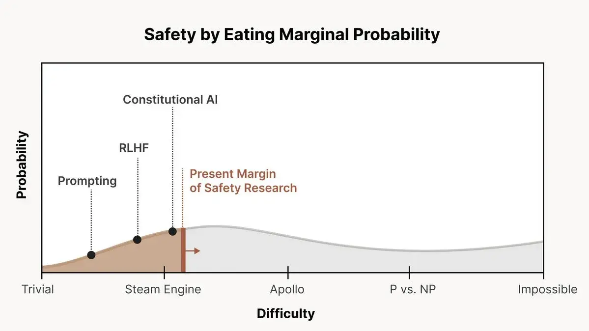
From this post; featuring “probability” with no scale on the y-axis, and “trivial”, “steam engine”, “Apollo”, “P vs. NP” and “Impossible” on the x-axis.
I am reminded of Tom Weller’s world-line diagram from Science Made Stupid.

From this post; featuring “probability” with no scale on the y-axis, and “trivial”, “steam engine”, “Apollo”, “P vs. NP” and “Impossible” on the x-axis.
I am reminded of Tom Weller’s world-line diagram from Science Made Stupid.
I followed the link to the tweet thread where the graph was found and it’s not much better
https://threadreaderapp.com/thread/1666482929772666880.html
Like, wtf does this mean.
Another recent HN title
“LLMs are too easy to automatically red team into toxicity”
Again, wtf does this mean.
I’m increasingly wondering whether I am officially too fucking old for this shit, and my brain has lost the plasticity required to make sense of all this, or I’m just spending too much time on the wrong Internet.