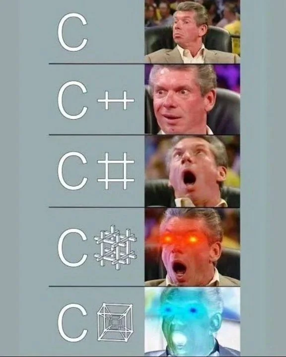
JPDev@programming.dev to Programmer Humor@programming.dev · edit-21 year agoEvolution of Cprogramming.devimagemessage-square72linkfedilinkarrow-up1969arrow-down10
arrow-up1969arrow-down1imageEvolution of Cprogramming.devJPDev@programming.dev to Programmer Humor@programming.dev · edit-21 year agomessage-square72linkfedilink
minus-squaredan@upvote.aulinkfedilinkarrow-up31·edit-21 year agoThere’s a lot of logos with hidden stuff like that. Amazon’s logo has an arrow going from A to Z, implying they sell everything “from A to Z” The Tostitos logo has two people holding chips (the Ts) and a bowl of salsa (the dot on the I): Toyota’s logo has every letter of the company name in it: The LG logo has the letters L and G in it:
minus-squaremvirts@lemmy.worldlinkfedilinkarrow-up8·1 year agoI hate it so much, but the Baskin Robbins BR has the number 31 in it
minus-squarelad@programming.devlinkfedilinkEnglisharrow-up2·1 year agoWhat does it mean? I would guess count of assorted flavours, but I am no expert in numerology
minus-squaremvirts@lemmy.worldlinkfedilinkarrow-up2·1 year agoYeah they have 31 flavors or something like that
minus-squarejaybone@lemmy.worldlinkfedilinkarrow-up4·1 year agoNow if only LG could make a microwave where the LED display didn’t go out after a year.
minus-squareJasonDJ@lemmy.ziplinkfedilinkarrow-up1·1 year agoI got mine 13 months ago, still going strong. I can check how much time is left on my phone anyway.
minus-squarejaybone@lemmy.worldlinkfedilinkarrow-up2·1 year agoI guess that will be a useful feature when the built in display goes out.
minus-squareBuddahriffic@lemmy.worldlinkfedilinkarrow-up4·1 year agoIt’s interesting to me that they used the English alphabet for the Toyota symbol instead of Japanese. Or is that symbol localised?
minus-squaresome_designer_dude@lemmy.worldlinkfedilinkEnglisharrow-up8·1 year agoI’d guess the Toyota one is just coincidental.
minus-squarefallingcats@discuss.tchncs.delinkfedilinkarrow-up3·1 year agoYeah, that’s quite a stretch from the looks of it
minus-squaregandarf @startrek.websitelinkfedilinkarrow-up7·1 year agoThe US is probably a much bigger market. I imagine it’s the same reason LG is English alphabet and not Hangul. Same with Kia, Hyundai, Samsung, etc. But this is mere speculation. I could be 100% wrong, happens daily!
minus-squareanguo@lemmy.calinkfedilinkarrow-up20·1 year agoIt always pissed me off that they use this as an example of white space use. No one sees it.
minus-squareanguo@lemmy.calinkfedilinkarrow-up5·1 year agoBecause a prof showed them on the first class. But in any case, if logo designers are the only ones to notice, the logo fails its purpose.
minus-squareoo1@lemmings.worldlinkfedilinkEnglisharrow-up7·1 year agoThere’s also a spoon to symbolise that the couriers were fed soup.
minus-squarechevy9294@monero.townlinkfedilinkEnglisharrow-up1·edit-21 year agoThats exactly what I wanted someone to do - post a picture because I was too lazy to google it myself! Thank you :)

Holy shit that’s crazy
There’s a lot of logos with hidden stuff like that.
Amazon’s logo has an arrow going from A to Z, implying they sell everything “from A to Z”
The Tostitos logo has two people holding chips (the Ts) and a bowl of salsa (the dot on the I):
Toyota’s logo has every letter of the company name in it:
The LG logo has the letters L and G in it:
I hate it so much, but the Baskin Robbins BR has the number 31 in it
What does it mean? I would guess count of assorted flavours, but I am no expert in numerology
Yeah they have 31 flavors or something like that
Now if only LG could make a microwave where the LED display didn’t go out after a year.
I got mine 13 months ago, still going strong. I can check how much time is left on my phone anyway.
I guess that will be a useful feature when the built in display goes out.
It’s interesting to me that they used the English alphabet for the Toyota symbol instead of Japanese. Or is that symbol localised?
I’d guess the Toyota one is just coincidental.
Yeah, that’s quite a stretch from the looks of it
The US is probably a much bigger market. I imagine it’s the same reason LG is English alphabet and not Hangul. Same with Kia, Hyundai, Samsung, etc.
But this is mere speculation. I could be 100% wrong, happens daily!
It always pissed me off that they use this as an example of white space use. No one sees it.
Logo designers do.
Because a prof showed them on the first class. But in any case, if logo designers are the only ones to notice, the logo fails its purpose.
Took me like a minute to find it
There’s also a spoon to symbolise that the couriers were fed soup.
Holy shit that’s crazy
To symbolise the ex was fed 🌚
Thats exactly what I wanted someone to do - post a picture because I was too lazy to google it myself! Thank you :)